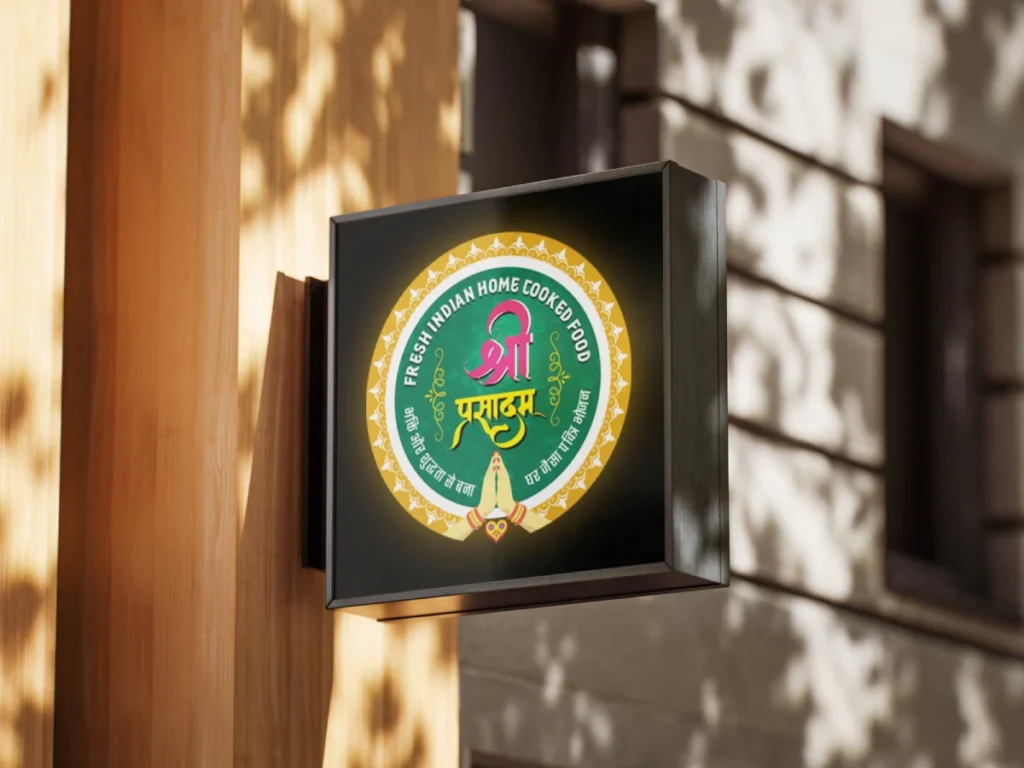
Shri Prasadam is a vegetarian tiffin and thali service built around one simple idea—good food should feel fresh, homely, hygienic, and accessible. The challenge was to turn this everyday food experience into a recognizable brand that people could trust and remember.
We built the identity around the thought “Swad Se Seva Tak”—bringing together the warmth of Indian food with a sense of care and service. The brand needed to feel traditional yet modern, premium yet approachable.
The identity combines Indian food culture with a clean, contemporary aesthetic. Every touchpoint was designed to communicate freshness, warmth, reliability, and quality—from the logo and menu to promotional creatives and customer communication.
Shri Prasadam was designed to be more than a tiffin service. Every interaction—from discovering the menu to receiving the meal—was given a consistent visual language that makes the brand feel familiar, trustworthy, and easy to remember.
A complete and cohesive food brand that brings together taste, trust, service, and visual identity—giving Shri Prasadam a distinctive presence across both offline and digital touchpoints.
A brand built around food, care, and everyday connection.

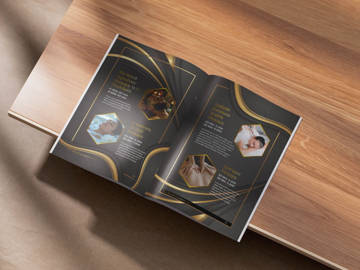
The Royal Luxurious Spa needed a brochure that could reflect its premium atmosphere, communicate its services clearly, and create an immediate sense of relaxation and luxury. The existing communication lacked the visual sophistication needed to connect with a high-end audience.
Amatra Pharmacy needed a logo that could establish a professional and trustworthy presence in the healthcare space. The identity had to feel clean, approachable, and credible while remaining simple enough to work across both digital and print applications.
WhatsApp us